The Project
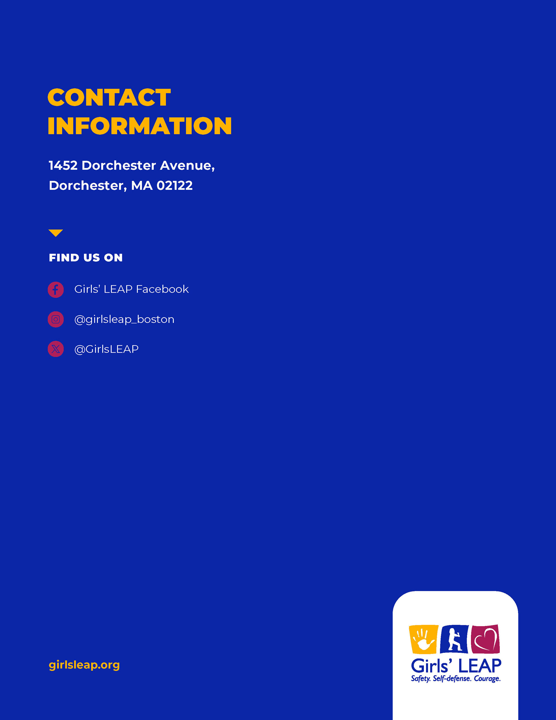
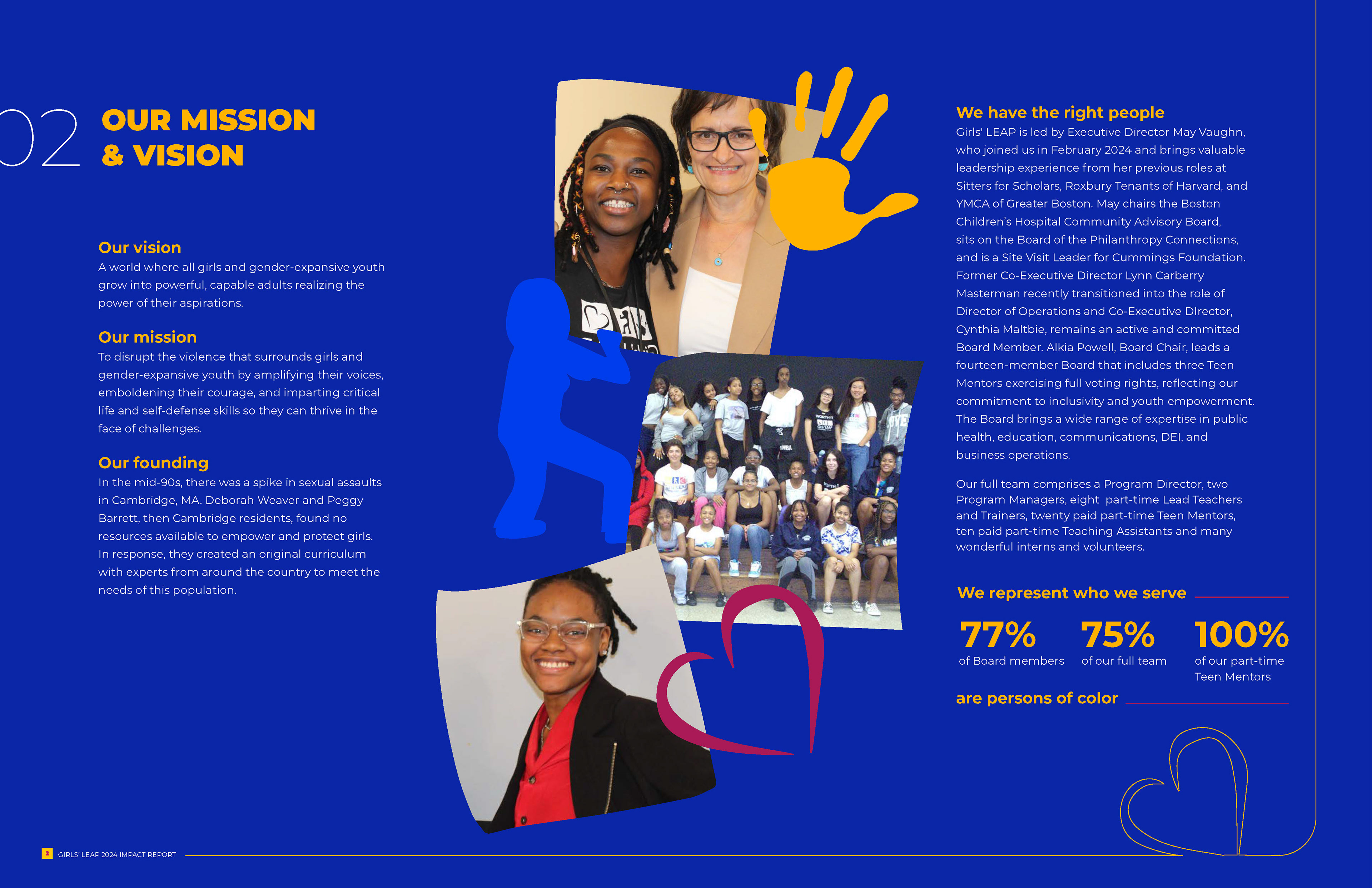
Girls’ LEAP partnered with me to design their FY2024 Impact Report—a flagship publication that captures a full year of achievements, youth stories, financial transparency, and organizational growth. The goal was to create a report that didn’t just recap the year. Still, it amplified the heart of their mission: empowering girls and gender-expansive youth across Boston to build confidence, resilience, and leadership.
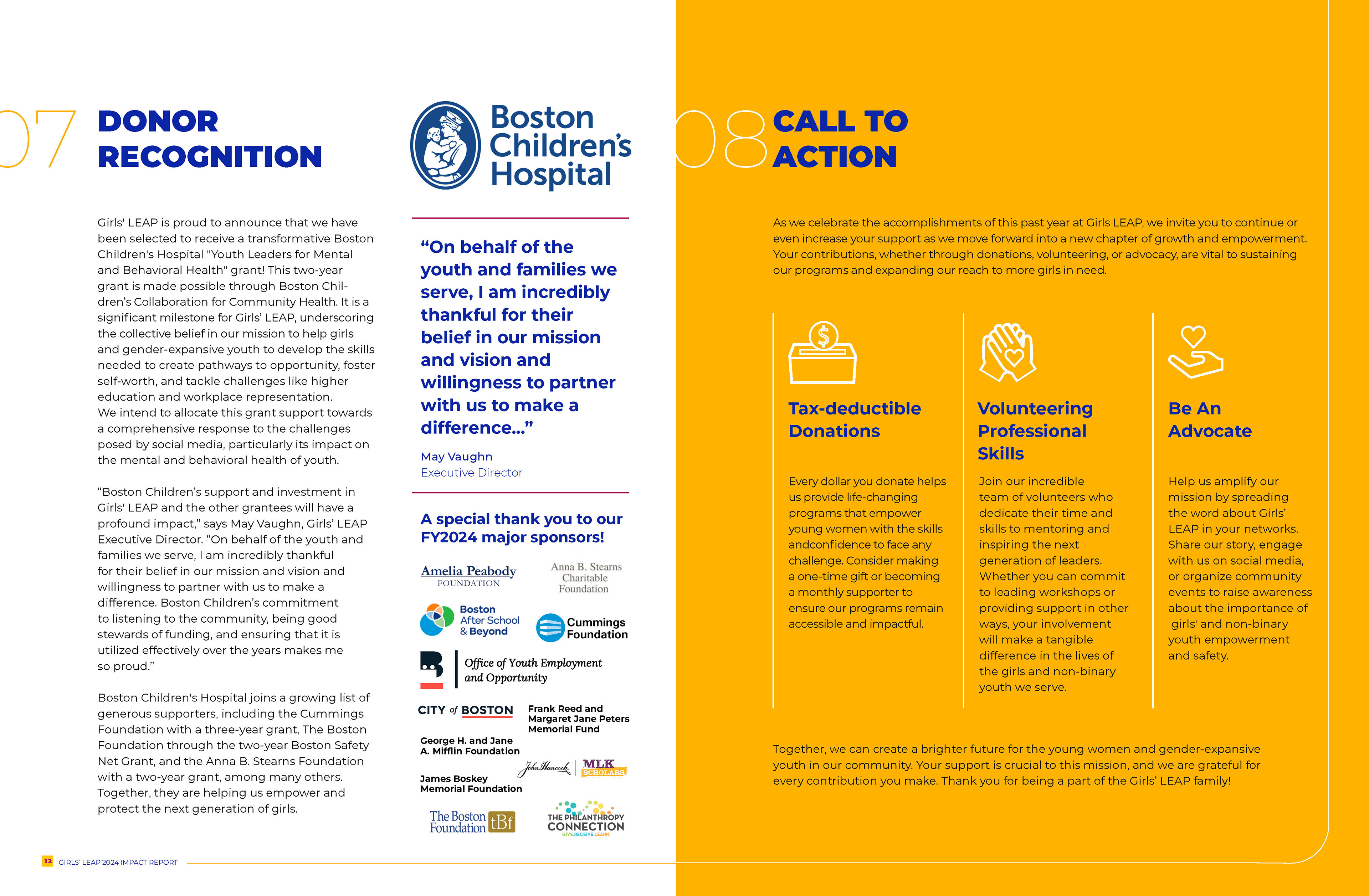
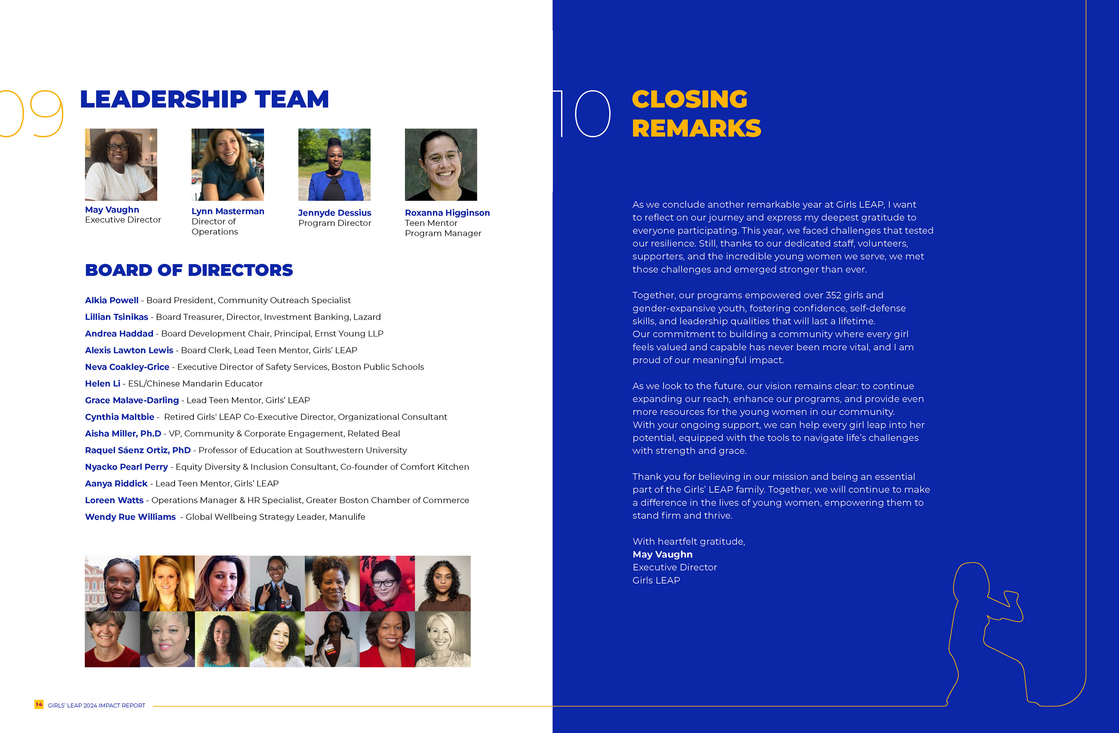
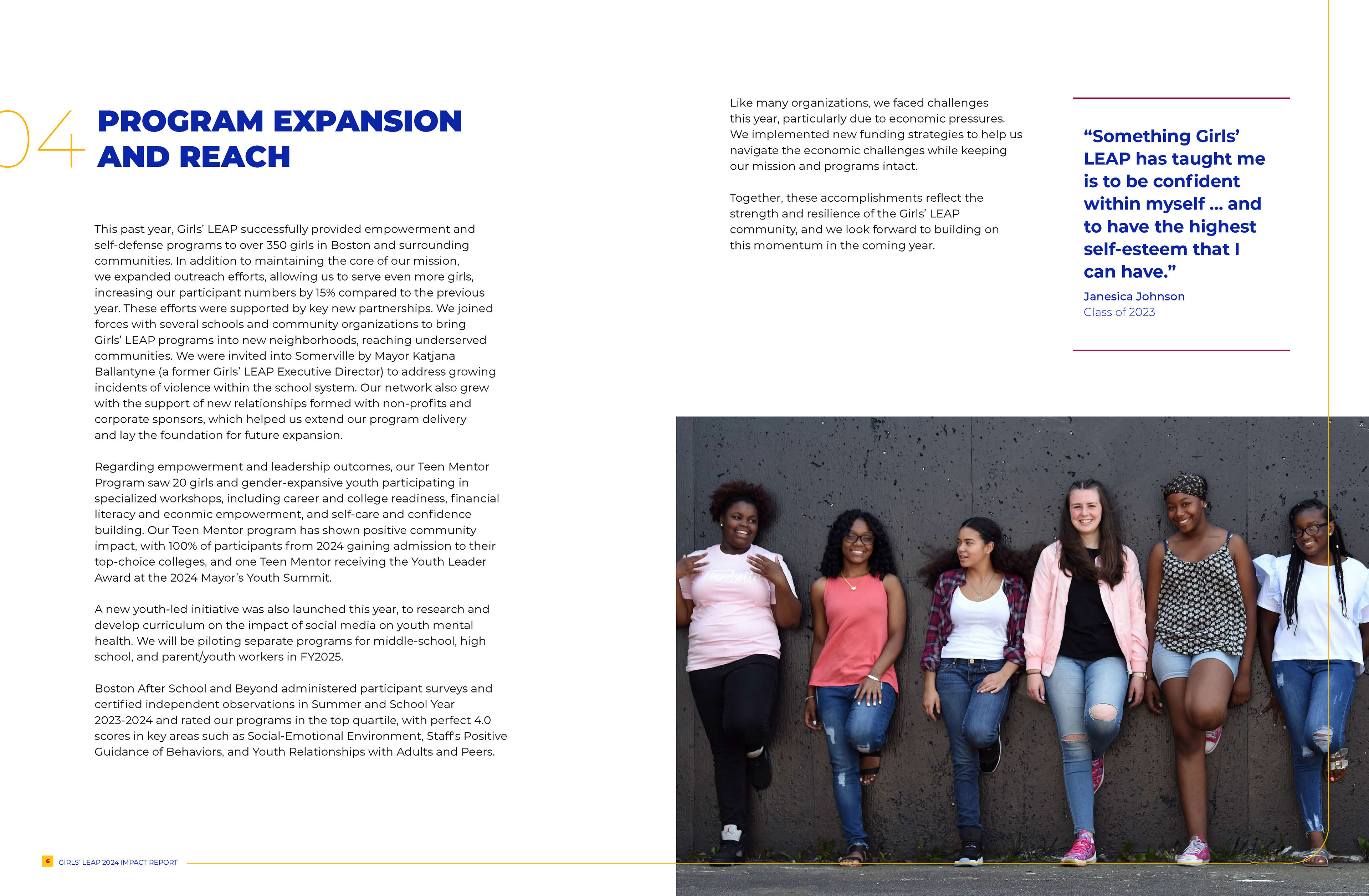
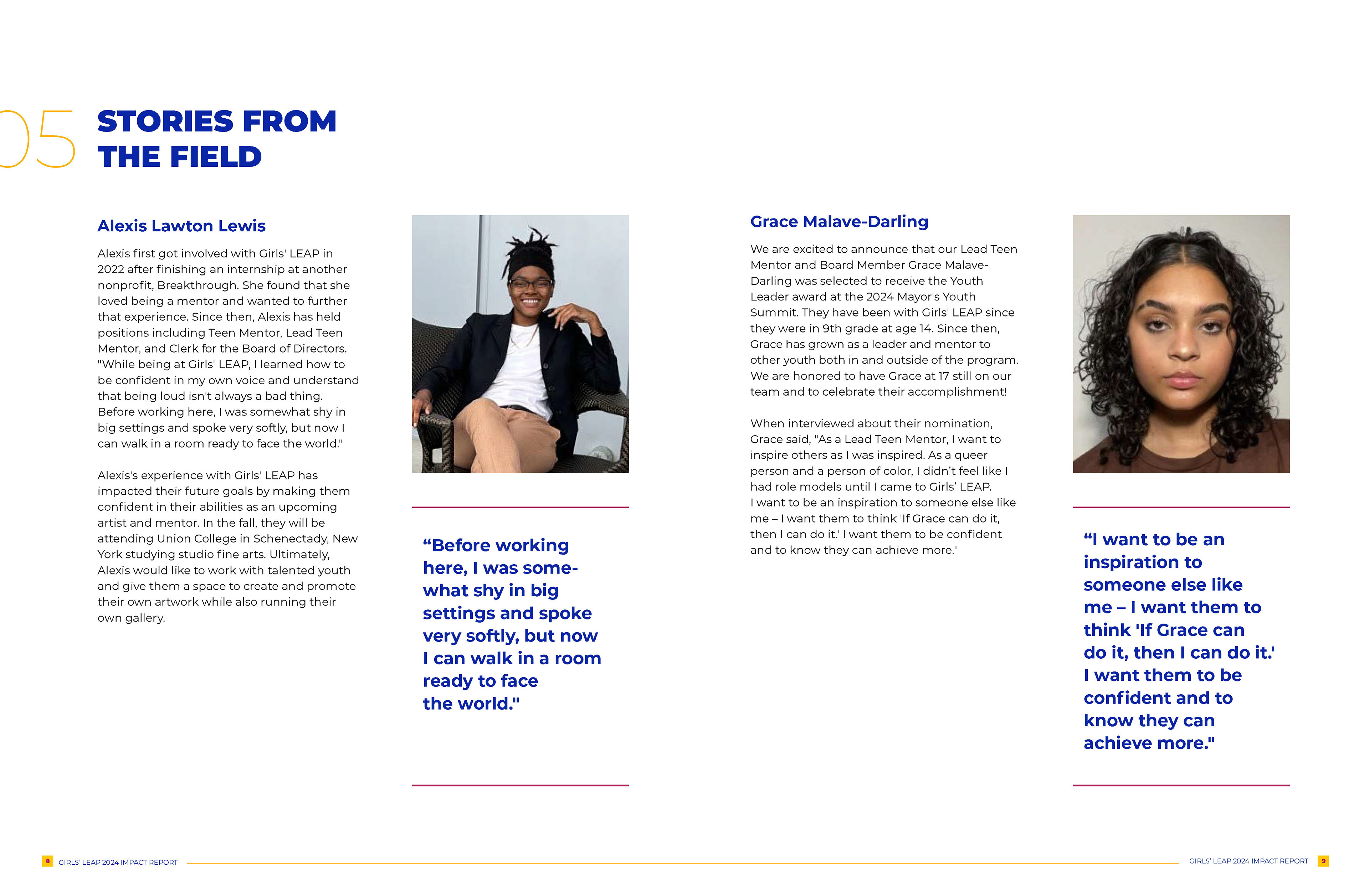
This project required designing a visually compelling 10-page report that felt energetic and youth-centered while still maintaining a level of polish expected by donors, foundations, and community partners. Working within their established brand, I expanded their visual language by incorporating expressive photography, hand-drawn motifs, vibrant graphic elements, and a structured grid system that kept the layouts clean and accessible.
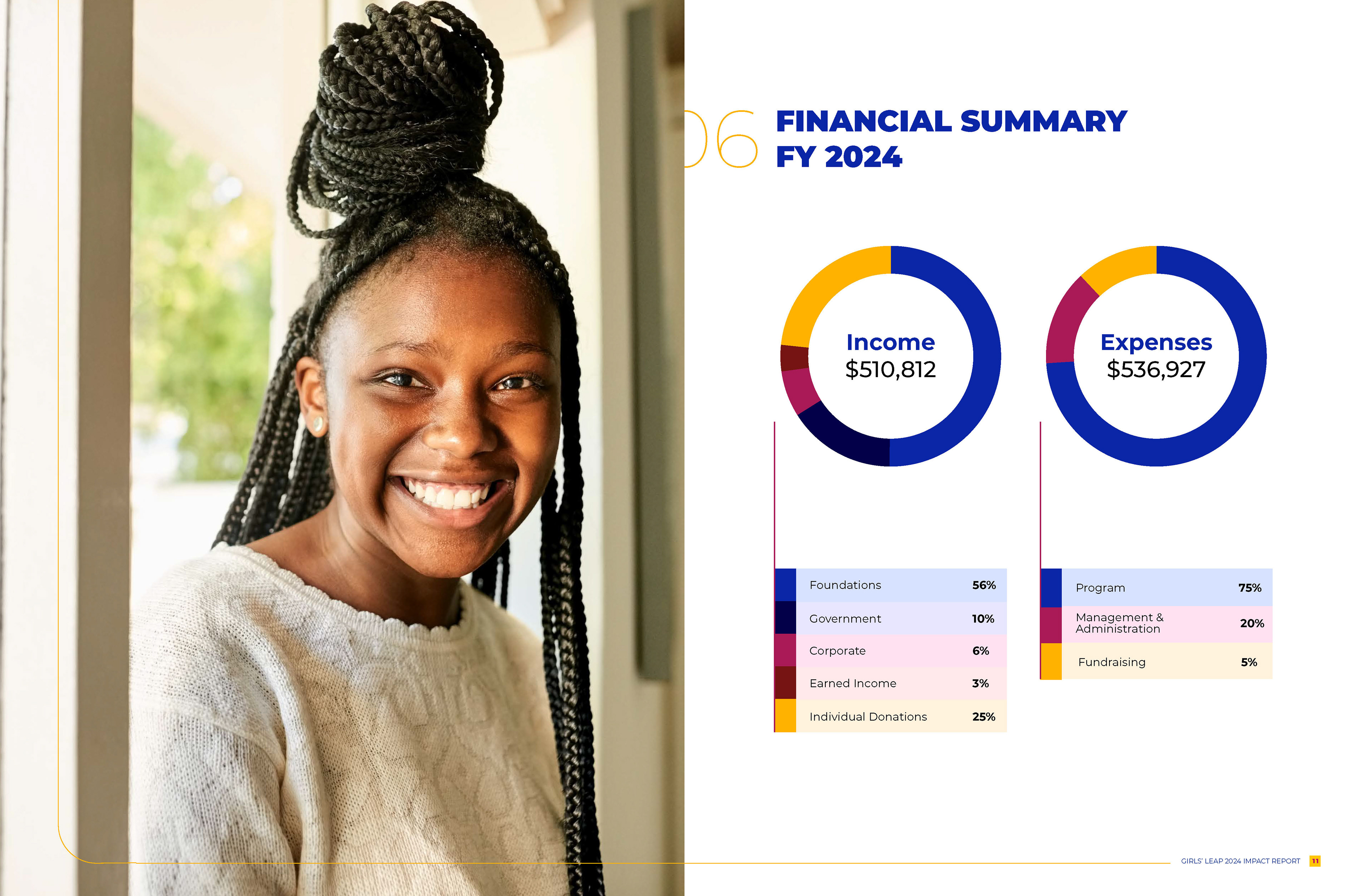
I also supported content shaping, refining how data, stories, and organizational milestones were communicated so each spread delivered clarity, emotional resonance, and flow. The final report serves as a multi-purpose tool for fundraising, grant applications, outreach, and community engagement.


The Challenge
Girls’ LEAP entered this project with powerful program outcomes and transformational youth stories, but they needed a designer to translate them into a cohesive, narrative-driven publication. The challenge was threefold: organizing a large volume of content, maintaining visual consistency across varied information types, and ensuring the final design aligned with the organization’s bold, heart-centered mission.
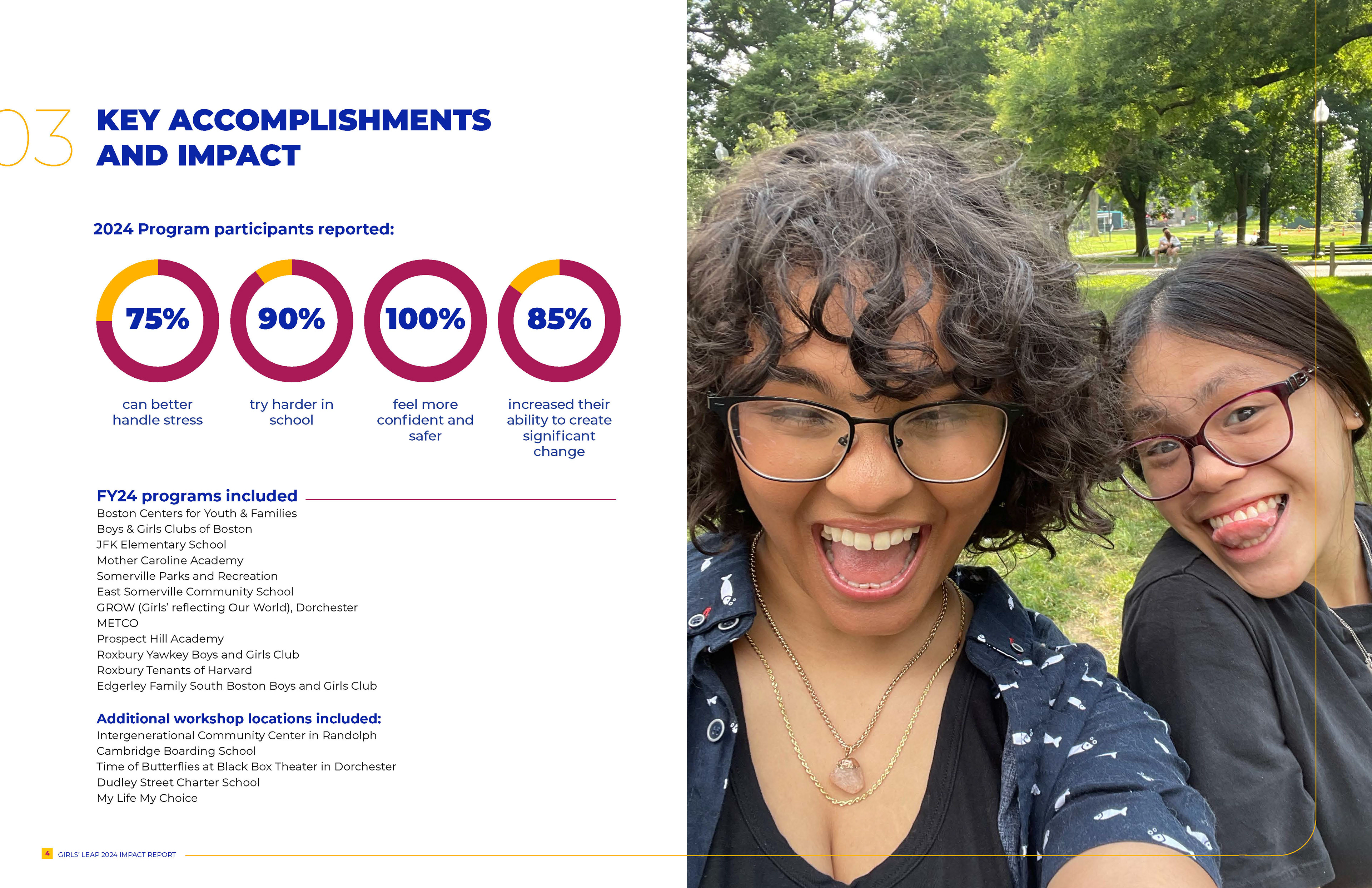
The report included everything from program expansions and testimonials to data visualizations, financial summaries, and donor recognition—each requiring a different visual treatment. My challenge was to shape these pieces into a clear story arc that would guide donors seamlessly from impact to opportunity.
Beyond content structure, the design needed to strike an intentional balance: youthful yet not juvenile, polished yet not corporate, energetic yet still readable. The report also had to function effectively in both print and digital formats, meaning color usage, typography, and layout decisions all required careful consideration.
By developing a flexible design system, consistent color coding, typographic hierarchy, iconography, and photo-driven layouts, I ensured that the report could communicate complexity without overwhelming the audience.
The Outcome
The final Impact Report elevated Girls’ LEAP’s storytelling and strengthened donor engagement.
Key results included:
• A fully branded, visually unified publication that celebrates the strength and confidence of the girls they serve.
• Clear, accessible data visualizations that highlight program reach and outcomes.
• Engaging layouts that spotlight youth voices alongside program achievements.
• A polished, professional asset that Girls’ LEAP can use for fundraising, grant applications, and year-round outreach.
The result is a compelling, easy-to-navigate report that reflects the heart of Girls’ LEAP’s mission and communicates their impact with clarity and emotion.
